Packaging design that sells on shelf and online
Packaging design that works in store, as an online thumbnail and in the unboxing moment.
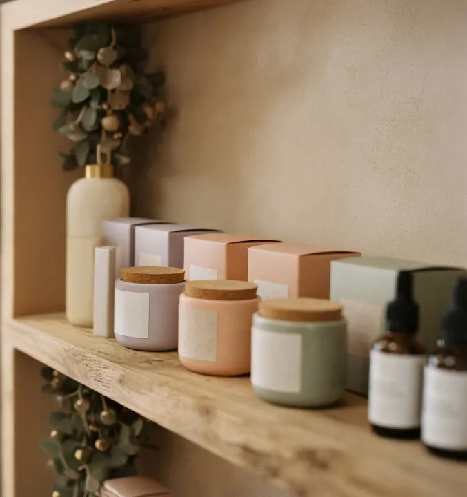
In a store, packaging competes with dozens of products on the same shelf. Online, it competes as a small image in a grid of search results. After purchase, it shapes the first experience of owning the product.
Good packaging design works across all three. This guide covers what to get right.
Hierarchy: what shoppers must see first
Shoppers scan quickly. Decide the order in which they should take in information, and design for it.
- 1. What it is: the product type, clearly
- 2. Why this one: the key benefit or difference
- 3. Who makes it: the brand
- 4. Which one: flavour, scent, size or variant
- 5. Details: ingredients, claims, instructions
On shelf vs online
- On shelf
- Online
Our view, scored out of 5. Design the front panel to work at thumbnail size first.
Design for the thumbnail
Most online shoppers first see your pack at around the size of a postage stamp. Test designs at that size. Simple shapes, strong contrast and one clear focal point survive the shrink; small text and subtle details don’t.
Budget for the full job
Single product
- Strategy & concepts: $3,000
- Design development: $4,000
- Artwork & dielines: $1,500
- 3D renders & photography: $2,000
- Total: $10,500
Range of six SKUs
- Strategy & concepts: $6,000
- Design development: $9,000
- Artwork & dielines: $6,000
- 3D renders & photography: $5,000
- Total: $26,000
Illustrative design costs only; printing and production are extra and vary widely by material and quantity.
Practical requirements
- Mandatory labelling for your category (e.g. food standards, therapeutic goods, country of origin)
- Barcodes sized and placed correctly
- Recycling information, such as the Australasian Recycling Label
- Dielines and print specifications from your manufacturer
- Print proofs checked on the real material
Test before you print
- Show designs on a mock shelf next to competitors
- View them at thumbnail size on a phone
- Ask target customers what the product is and who it’s for
- Check colour on printed proofs, not just screen
How this looks in your industry
Illustrative examples
Closest to you
Retail
A craft chocolate maker entering supermarkets
The problem: Packs blended into the shelf.
What changed: Redesigned with bold colour blocking and a clear flavour hierarchy.
Result: Stood out next to competitors.
Closest to you
E-commerce
A tea brand selling online
The problem: Pack details disappeared at thumbnail size.
What changed: Simplified the front panel for small screens.
Result: Clearer product listings.
Closest to you
Health
A natural deodorant brand
The problem: Variants looked too similar.
What changed: Gave each scent a distinct colour and icon.
Result: Shoppers found their scent quickly.
Common mistakes
- Prioritising the brand name over what the product is
- Designs that disappear at thumbnail size
- Variants that look too similar
- Missing mandatory labelling
- Approving colour on screen instead of a printed proof
Key takeaways
- Set a clear information hierarchy
- Design for the thumbnail first
- Make variants easy to tell apart
- Test on shelf and on screen
Frequently asked questions
How long does packaging design take?
For a single product, four to eight weeks from brief to print-ready artwork. Ranges and regulated categories take longer.
Do I need 3D renders?
They’re useful for online listings and retailer presentations before stock is printed.
What about sustainable packaging?
Choose recyclable or compostable materials where possible and label them clearly. Shoppers increasingly look for it.
Your next step
Design packaging that gets picked up
We design packaging that works on shelf, online and in the hands of your customers, ready for print.
Explore packaging design